
Title: Milwaukee flag
Size: 7x5in.
Exhibition text:
Process:
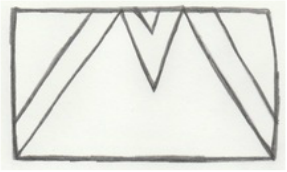
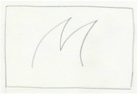
First, I watched a video which showed me and gave me some ideas on how to do a flag and what not to do. Then, started to have some ideas, since the beginning I knew I wanted to put the "M" in it to let everyone know that was the first letter of the city's flag. Since the "M" is symmetrical it was a good idea to put it there because it doesn't matter from where you look at it, it's going to be the same, it's not going to change. I couldn't just leave it like that, it was to plan, so I decided to do the "W" as well. I wanted my flag to be looked at and be comprehended really quickly.
Size: 7x5in.
Exhibition text:
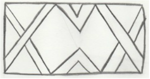
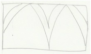
- My flag is a inspiration of the lake Michigan, because of the colors, blue and white which represent the colors of the water. I also wanted to do a "M" for Milwaukee, then I started to a reflection of it, to show that it was being reflected in lake Michigan and it also made a "W" for Wisconsin. So when you see the flag you can automatically see Milwaukee, Wisconsin in it with the two letters. I really didn't take any ideas from other flags, only the colors.
Process:
First, I watched a video which showed me and gave me some ideas on how to do a flag and what not to do. Then, started to have some ideas, since the beginning I knew I wanted to put the "M" in it to let everyone know that was the first letter of the city's flag. Since the "M" is symmetrical it was a good idea to put it there because it doesn't matter from where you look at it, it's going to be the same, it's not going to change. I couldn't just leave it like that, it was to plan, so I decided to do the "W" as well. I wanted my flag to be looked at and be comprehended really quickly.
My first idea was to just do an "M" for Milwaukee but then I did the "W" to have a more detailed and symbolized flag.
|
|
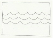
Other flag ideas
|
|
|
|
|
Artistic Inspiration:
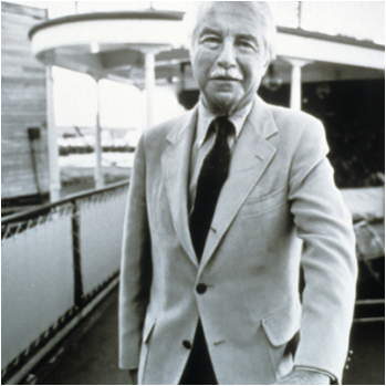
I was inspired by Walter Landor, to do my flag. Walter Landor did very famous labels such as Levi's, FedEx, Frito Lay, Marlboro and much more. I think his labels are very straight to the point and when ever you see them you can automatically remember what that is from. They are very popular because of that too, they aren't hard to draw by memory and that's what I want people to have the same connection with my flag like they do with Walter Landor work.
cemporcentodesign.blog.br
|
|
Reflection:
Some of the skills that I learned during this process of doing the flag was that I had the opportunity to learn more techniques, more than the ones I already knew when I did my digital collage, because it was made with the same computer program. Something that I would of done different would be to play with the colors more, to see what would be the best choice. Not just try one pair of colors and leave it like that. Maybe the flag would look better if the background wasn't white, maybe it would stand out better if it was another color and the letters would be lighter. Also I would of done it more symmetrical. The M more even to the W, like if it was reflected into a mirror. I basically wanted to make Lake Michigan the main focus on my flag because I think the lake is a very important part of Milwaukee. I tried to capture that idea of water like I had said before. But first of all I wanted to make it simple, not to many detail but not to little either. Easy to draw by memory, and with easy colors too, only 3 so that way you can remember. My purpose is to not make a very difficult flag that even a little kid can draw it.
